
PROJECT 03
The goal of this project was to help the client redesign their current Investor Relations website by making it more user-friendly, adding a sophisticated look and more transparency for the end user.
Service
UX/UI Web Design
Client
IR Insurance Company
Year
2020


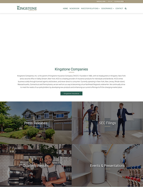
The Before
In any marketing realm, we have a very small window to engage consumers. Typically, we have less than five seconds to get their attention. If we fail, bye-bye!
When I first landed on this client’s corporate website, I felt there was too much negative space between the universal headline and the actual content. For me, this was prime real estate! This space was the “perfect window” for the consumer to either engage or exit. Information was also being hidden and the site seemed difficult to navigate — it was hard to know if this was their homepage or IR site.
Here, my goal was to capitalize on that valuable space. I wanted to close that window and entice the user to engage and make the important information easier to access.
The After
To accomplish my goal, I added a visual banner on the top portion of the page — this helps tell the story of what their core business is. Providing visuals is essential to engaging users. I also wanted to make the “latest events” widget highly visible by adding it into the banner — something investors find very valuable. I then made all the valuable information, which was previously hidden, visible with a clean and simple look. This allows the user to find the information easily without having to dig for it. The new design gave more light and transparency to their Investor Relations website - something a lot of investors look for when investing in a company.


